Christian P. Sarason | Agile. Ocean. Science. Software.
Creating an Orca Simulator to understand the problem space
by Christian P. Sarason
Sometimes you just have to write it out
There comes a point in every exploratory analysis where the easy insights and visualizations are done, and the next step is to dive into the nitty gritty. For me this usually mirrors a process I discovered in college when writing up a paper on a deadline. My process for writing term papers in college unfortunately boiled down to something like:
while ( chillFactor ):
  warn("you really need to get started on that")    #this gets written to a log
                                                    #somewhere
  freakOutFactor = (deadline - currentTime)

  if (freakOutFactor < chillFactor):
    procrastinate(10)
  else:
    FreakOut.write_10pages_bs()                     # get it down on paper
    FreakOut.discover_best_argument_in_Conclusion()
    FreakOut.rewrite()                              # reframe your paper around
    sleep( 2*60*60 )                                # your new discovered argument
    chillFactor = False                             # TODO: while loop not my favorite
Does your exploratory analysis ever feel like this? You have a rough idea, and start down the rabbit hole. Google a bit. Look for other approaches. Try a new plot (learn some cool stuff but realize that plot doesn’t make any sense).
Eventually, for me, I get to a point where I just need to write out a model of the system I’m trying to analyze or visualize, and then I can create some data that fits.
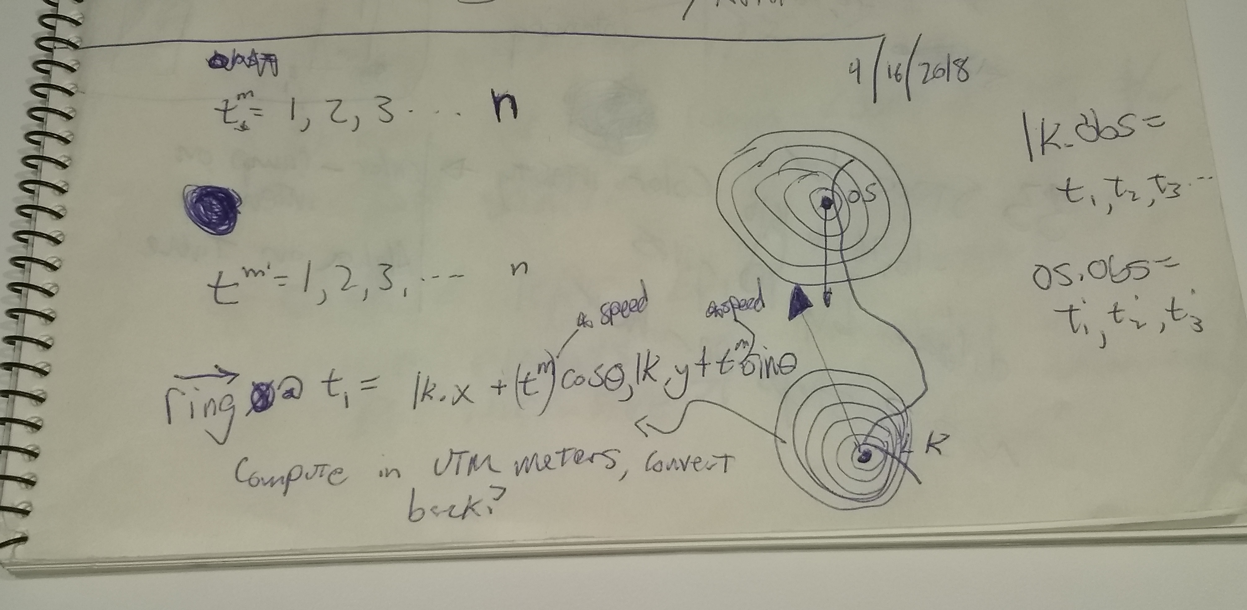
I’ve been working with the good folks at Orcasound.net to try and figure out interesting ways to visualize when something “interesting” is happening on their acoustic network, and have gotten to the point that I needed to come up with a visualization that modeled what might happen as the Southern Resident Orca pods swim past their hydrophones.
What I ended up creating was a basic model of acoustic intensity that varies as 1 / r^2 from the source, and allowed me to create a bunch of synthetic data that is suitable for visualization. Since my goal is really to think about different ways to visualize this information in a geographical context, I didn’t worry too much about whether the acoustic model was exact — it is close enough for what I need. A basic plot of orca “locations”, colored by the intensity of the synthetic signal creates a nice matplolib plot.
fig,ax = plt.subplots()
ax.plot(limeKiln['location'][0],limeKiln['location'][1],'r*')
ax.plot(orcaSound['location'][0],orcaSound['location'][1],'r*')
ax.scatter(orcaLocationsDF[0],orcaLocationsDF[1],c=orcaSound['df'][1])
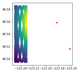
This plot is interesting, but is not actually the data that I will have, which will be centered at the hydrophone locations and only be a report of acoustic intensity at a given time. My first crack at visualizing this just added circles centered on the hydrophones that change in color/intensity based on the model. Not perfect, but helps me get my head around how the data that is coming in is going to look.
I think at this point I’m about in the “discover_best_argument” stage of my exploration process, and I now have a much better grasp of where to go. Write it down, draw a picture and above all keep at it until it makes sense!
Feel like playing with python to create some simulated data? Check out my Notebooks folder.
tags: tech4good - ocean - visualization - whales