Christian P. Sarason | Agile. Ocean. Science. Software.
Tapping into a geyser of deep sea data
by Christian P. Sarason
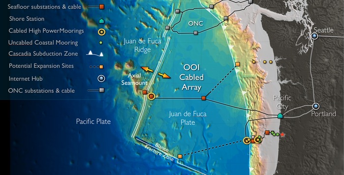
NEPTUNE, 20 years later
When I was graduate student at UW in the mid-90s, some blarney beer-filled conversations about “What if we…” turned into a passion for John Delaney, who proceeded to suck in a bunch of other folks around the idea of creating the equivalent of a deep-space telescope, but pointed at the small tectonic plate just off our coast, aptly named NEPTUNE. Nearly 20 years (and a boatload of work) later, the NSF sponsored OOI Cabled Array is operational off of the Washington and Oregon coasts!
A couple of weeks ago I spent 3 days in MSB 123, the same room where I defended my Masters, and learned the ins/outs of how to access the data that is streaming in from the installation at the Cabled Array Hack Week (CAHW).
Making some interesting plots
There is a ton of different data streaming in from the cable — with everything from humdrum Conductivity, Temperature, Depth (CTD) data to more esoteric physical and biological measurements like Nitrate, Oxygen, and Spectral Irradiance. Also accompanying these measurements are a plethora of acoustic sensors, both active (ADCP) and passive (hydrophones). I chose to use the CAHW to learn how to access the data and gain access to as much data as I could reasonably use as a basis for polishing up my dataScience techniques.
Plotting up temperature and salinity
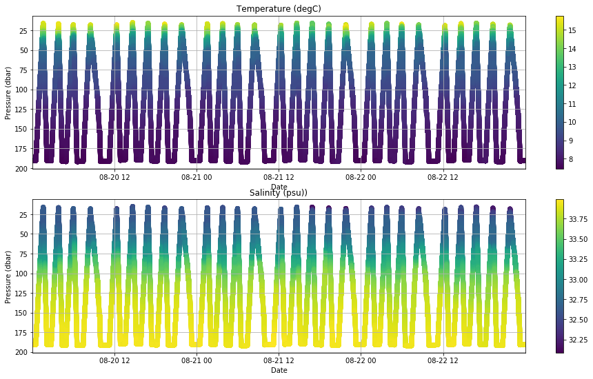
First, I decided to plot up a simple color-coded scatter plot of the measurements over time. The tools have become so much easier than when I was doing a lot of this kind of analysis at UW and 3TIER as a scientific programmer — now dates are automagically handled and the netCDF support in python is really good.
# Create a colored scatter plot, with data plotted
# on a depth vs. time axis.

fig,(ax1,ax2) = plt.subplots(nrows=2,ncols=1)
fig.set_size_inches(16,9)

# plot temp and salinity curtain plots
ax1.invert_yaxis()
ax1.grid()
ax1.set_xlim(ds_time[0],ds_time[-1])
sc1 = ax1.scatter(ds_time,pressure,c=temperature)
ax1.set_xlabel('Date')
ax1.set_ylabel('Pressure (dbar)')
ax1.set_title('Temperature (degC)')
cb = fig.colorbar(sc1,ax=ax1)

ax2.invert_yaxis()
ax2.grid()
ax2.set_xlim(ds_time[0],ds_time[-1])
ax2.set_xlabel('Date')
ax2.set_ylabel('Pressure (dbar)')
ax2.set_title('Salinity (psu))')
sc2 = ax2.scatter(ds_time,pressure,c=psu)
cb2 = fig.colorbar(sc2,ax=ax2)
plt.show()
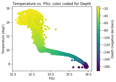
T-S plots
Now, more complete colored scatter plot, with data plotted on a temperature vs. salinty axis, color coded for depth. The data was collected over 3 days, so some of the variability we see in the temperature and salinity values is due to different parts of the ocean wafting by the profiler.
fig2, ax3 = plt.subplots(nrows=1,ncols=1)
sc3 = ax3.scatter(psu,temperature,c=(-1.0*pressure))
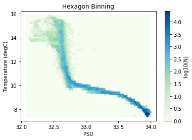
And the same plot, but using “hexbin” which averages values that fall within the hexagons you can see in the plot.
hb = ax4.hexbin(psu,temperature,
                gridsize=50,
                bins='log',
                cmap=plt.cm.GnBu)
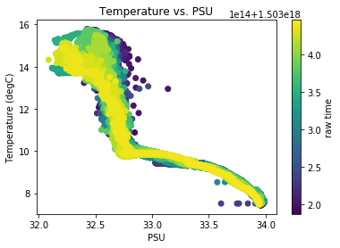
Finally, it occurred to me to split up the T-S plot by color to get some insight into when the different water masses went through – this is a quick and dirty analysis, but interesting. The fun part of this analysis was that once I had the data loaded into my Jupyter notebook, playing around with it was super easy and got me instantly thinking of science questions instead of “how do I plot that again?!?”. This is the way exploratory data analysis was meant to be!
sc3 = ax3.scatter(psu,temperature,c=(ds_time))
Interested in doing some of this stuff on your own?!? Check out the python project my friend Don Setiawan built called VisualOceanPy. You can find some python code and my Jupyter notebook in the examples folder.
Fun!
tags: living-in-the-future - tech4good - ocean - visualization